If we also look at an extract from 'The Dark Knight' There is also music playing in the background. We then felt it was important to include it into ours to stay truer to the genre. This is our finished animatic with music included, we have also animated some of the stills slightly so they are more accurate to what we want to accomplish. The timing of the edits has also been edited to the length of the scene instead of every two seconds. This adds a better and more accurate feel to the animatic.
Tuesday, 2 March 2010
Storyboard extented
After finishing the animatic we noticed that we hadnt included any music in it. This is not typical of the Thriller genre, or the Detective genre. If we look at the video of 'Inspector X and The Eternal City' we can see that in the opening scene music is playing in the background
If we also look at an extract from 'The Dark Knight' There is also music playing in the background. We then felt it was important to include it into ours to stay truer to the genre. This is our finished animatic with music included, we have also animated some of the stills slightly so they are more accurate to what we want to accomplish. The timing of the edits has also been edited to the length of the scene instead of every two seconds. This adds a better and more accurate feel to the animatic.
If we also look at an extract from 'The Dark Knight' There is also music playing in the background. We then felt it was important to include it into ours to stay truer to the genre. This is our finished animatic with music included, we have also animated some of the stills slightly so they are more accurate to what we want to accomplish. The timing of the edits has also been edited to the length of the scene instead of every two seconds. This adds a better and more accurate feel to the animatic.
Friday, 12 February 2010
'The Final Cut' Storyboard
We first constructed our storyboard on paper. We then scanned the individual sheets into the computer.
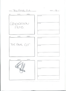
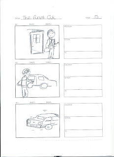
We then edited these in Photoshop and imported them into the video edting software and produced our animatic. We created the title sequence for 'Eradication Films' and 'The Final Cut'.


We then edited these in Photoshop and imported them into the video edting software and produced our animatic. We created the title sequence for 'Eradication Films' and 'The Final Cut'.
We then combined the titles and the still shots into a short animatic. later we added sound to this.
Evaluating the animatic. The added sound i feel worked quite well, although in some cases low quality sound files were used but i feel this unoticable. Also many of sound added in the animatic are infact diegetic sound and there for would not need to be added in the final production. Sounds like the thunder storm however would be, i feel this sound works very well as it creates tention very well and is an easy effect to create.
All the transistions in the animatic are fades however in the final peice the majority will be cuts. Fades were added in the animatic to create and easier effect on the eye and cuts were quite sharp.
This animatic shows the thriller genre very well as it shows how the tention is built with the use of the thunder storm and over the shoulder shot of the serial killer. The thunder storm plays for all of the high tention part of the animatic and stops abruptly when we are introduced to the detective. This realises the tention built up in the first scene. A common technique used in other thriller films such as the 'Dark Knight'.
Producing the animatic has helped us prepare for the shot in several ways. It has given us a better idea of how certain shots and the sound effects will be, and if the effect created is the deisired one. Also a better timing in the shots has been achieved as some shots were orginally too short or too long.
Saturday, 30 January 2010
The Final Cut
After researching the thriller film genre we decided to name our film 'The Final Cut', this seemed an appropriate name because one of the main characters in our media extract is a serial killer who uses blades to kill his victims. After we decided the basic idea for the film last week, we assigned each other jobs to do to assure the success of our media extract these are:
Camera Work: Joe
Director: Katie
Storyboard: Ellen
Costume/Props: Ellen
Location: Joe
Audience: Katie
Sound
Titles
Key Shot
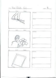
‘The Final Cut’ titles. Rain fades in – thunder storm starts.
Serial killer cleaning/sharpening knifes. High tension music, Cleaning/Sharpening, Thunder storm. Over the shoulder shot.
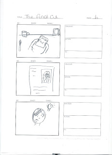
Picks up Polaroid’s of victims, starts to look through them. Thunder storm, Diegetic, High tension music. Over the shoulder shot, tracking down to the Polaroid’s.
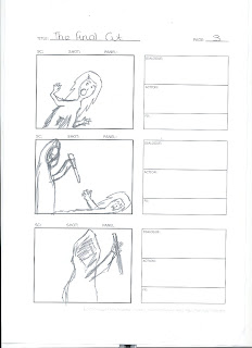
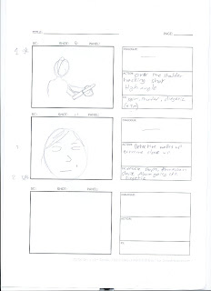
Victim just about to be killed. Victim screaming, Knife swinging, Thunder storm, High tension music.
Tracking two shot of the murder.
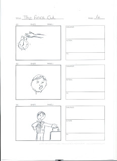
ECU of detective waking up. Diegetic. ECU
Alarm goes off detective slams hand down on it and wakes up. Alarm, Hand slamming, Diegetic. CU
Detective comes out of house, get into car and drives to work. Diegetic. Titles. Tracking/Pan shot of car pulling out.
Case file on desk of victim in flashback, picture of dead victim at crime scene. Diegetic, Speech. Tracking shot round the back of the detective.
Detective starts to notice a pattern between several murders – Signature left by the serial killer. Diegetic, Speech. Close up of the detectives face.
Location
Serial Killers lair: A garage
Serial Killer:
Dark clothing
Dark Hoody
Two knifes
Dark gloves
Fake blood – Corn Syrup, red food dye.
Suit
Briefcase
Car
Murder Victim:
Fake blood – Corn Syrup, red food dye.
Clothes
Misc:
Alarm clock
Case file
Coffee mug
Picture frame with detective’s family
Bloody cloth
Breakfast items; toast, toaster etc...
Polaroids
We also looked at what our target audience would be if the film was released. like most other Thriller films ours would appeal to the ages 15-24 as this is the main cinema going age. As our film would classify as a 15 in the UK this would be the minimum age ours could appeal to. The detective element to our film would hopefully interest an older generation of viewers who are not just interested in a high action film but also one that makes the viewer think, which is what hopefully our film would achieve. Both genders would be drawn to the film, although men more so than women as this film will contain some scenes of violence. We would aim this film towards those interested in crime dramas like 'Law and order' but also those interested in high action films like 'Crank'. Detective films such as 'The Maltese Falcon' we thought were to far away from our story line although ours is about the relationship between a serial killer and a detective, therefore we chose not to draw inspiration or consider its target audience as a substantial one. We also looked at the target audience for 'Se7en' as this is probably the closest filmd to ours in terms of genre and style. In this film the realtionship between the serial killer and the detective is explored and developed which is similar to our. Our taget audiences would therefore be similar. Our primary audience would therefore be males between the ages of 15-24 that are interested in detective/action thrillers. Our secondary audience would be the over 25's and females.
Friday, 22 January 2010
Research of the Thriller genre
For our media project we chose the Thriller genre. Our idea is focused around a detective and a serial killer he is chasing. The film will focus on the battle him and the serial killer have, ruining his marriage and his social life in the process. The victims also feature in our media text with a series of flash backs from the serial killer before and during the murders, and the detective afterwards at the crime scene.
We first looked at films like 'Se7en' and 'The Dark Knight' as they are very popular Thriller films.
We soon released however that the Thriller genre encompasses a massive spectrum of films such as, suspense thrillers, action or adventure thrillers or sci-fi thrillers such as alien. these are just a few of the genres that Thrillers can become, so choosing the right film to take notes a draw inspiration from was difficult. Films like 'Vertigo'and 'Friday the 13th' were others we originally looked at but didn’t meet our sub genre. We did however learn a lot about how to build suspense up successfully with the use of dramatic music and a varying length of edit.
As our Thriller was a Horror/Detective Thriller we had some trouble locating similar films we did however find to on you tube, these were 'Transfixed Theatrical' and 'Inspector X'.
We finally settled on a few ideas for the general feel of our film. We decided that our opening sequence should feature low key lighting creating a very dark and eerie effect. Hiding the serial killers face is also a priority as this builds up tension in the audience as he remains anonymous. High tension music will also feature this is the one thing all thriller films have in common, this builds up the suspense and tension in a scene. Like most other thrillers there is high emphasis on the silent parts of the films, as this also creates a sinister effect.
Sunday, 15 November 2009
Prelim Task
The prelim task was a short film to show how well we could use editing and cutting techniques. We had had a few lessons towards learning about camera angles and the way films edit, how much time is spent between each edit and how easy they make it look.
We were put into groups of 3 and 4. My group was a 3 and consisted of me, Ellen and Katie. The first thing we had to do in a group was come up with an idea, after much debate we chose to do a mini action sequence about a hit man. There are two actors in our prelim, Alec and Katie. Alec played the hit man and Katie the person who is giving the contract out. Both characters remain nameless during the text.
After we completed the story board we showed it to Alec so he could get an idea of how we wanted it to turn out and how he had to act in it. Katie who took part in the creation of the story board already had an idea of how to act in it. This helped immensely because it allowed us to communicate better with the actors chosen and made shore we were on the same page when it came to the production of the text.
After we had shown everyone through the story board, we got a camera and tripod and looked for a location to film. We already had the college in mind when we were creating the story board, so we decided to go with the college hallway and a class room near that hallway. We were lucky with the location we chose because no lessons were taking part during the filming which meant we didn’t have to worry about people coming in and out of classes or the classes making any noise during filming.
Alec and Katie worked quickly and well together, we were able to quick successful shot as well as getting the feel right for the film. Our total filming time was around one hour, we were pleased with how long it took to film because it showed how well we could work together. In the film we had to show at some point someone walking through a door. This helped us learn what shot types worked best and helped us improve on our continuity.
After we had finished filming we uploaded the shots on to the college’s editing computers and used Adobe Premier Elements 4.0 to edit the text together. We had filmed several different types of shots some of which during editing we decided not to use because they didn’t feel right when watching the text.
Our prelim opens with an establishing shot of an unknown building, it then cuts to an extreme long shot of the hit man walking up towards a door and opening it. After this shot it cuts to an inside view of him opening the door, this is a medium shot. It shows our first piece of continuity editing and also a character walking through a door, which was the main aim of our prelim task. After this shot it cuts to a shot of the hetmans legs as he walks through the corridor. This shot is followed by an extreme long shot of the hit man walking down the corridor and into a second door. It cuts to a second medium shot as the hit man walks through the second door, this shot is also the point of view of the contract giver. We then cut to a two shot of both the characters this shot is also a medium shot. The next shot is an over the shoulder shot of the contract giver handing a note to the hit man were our first line of dialogue is said “ are you ready for this?”. We then cut to the reverse shot where the hit man picks up the note which reads “kill him!” and says “it’ll get done” which completes the two lines of dialogue needed for the prelim task. It then fades to black and the text ends. There are 9 shots used in total.
I am very pleased with the text we produced as a group.
Sunday, 11 October 2009
Analyse a UKTV drama title sequence
Right, so im choosing EastEnders again, i have no idea why because I don't even like the program, hmm. Yes, so any ways a link to the titles is here. Apparently the titles have changed and these are the new all shiny ones that they paid someone millions of pounds to do, which to be honest is a bit of a rip off considering all its doing is zooming out, good for them.
The titles open with you being shown a blue rippled surface which you can safely assume is a river, with a slight mist over the top, maybe this symbolises that there is an air of mystery to the new titles and what is about to happen in the show, establishing the genre of it. then again maybe its pure coincidence. at around 8 seconds you can see the beginning curves in the river and what is quite clearly the millennium dome, so we have a location for where the program is set now. London, England if you didn't know. there is also a brief silence at the begging when the titles start to role, this creates quite an ominous effect in my opinion. the titles are the ever famous EastEnders ones(duh) and play throughout the sequence. The camera then rapidly zooms out whilst turning to the left finally stopping to at 23 seconds to establish which part of London the drama is set it, the east end believe it or not. at 24 seconds the EastEnders logo fades into the shot, revealing the name of the drama followed by the BBC logo the producers of the drama.
The title sequence on purpose i would presume, is rather serious in how it is shown which shows that this is a serious drama and not something aimed at children. The music played other the top of the sequence is again cheerful, er serious this is done in conjunction with the video to reinforce the series nature of the show.
Thursday, 8 October 2009
What do you understand about the concept of televison drama?
The EastEnders website in my opinion is rather boring, well maybe boring's the wrong word here, more 'adult' so to speak. But then again EastEnders is a drama who's target audience would be young adults. this is shown throughout the website, a simple colour scheme of white and grey which again emphasis the professional 'adult' look, and clear easy to read text. The first the you see i suppose would be the EastEnders logo although this is of in the corner and rather small. The website also is unchaotic, is that even a word? Anyways its seperated under a tool bar, with links to the home page, videos, episodes, archives, characters and cast and many more that would make this list to long a laborious to read. There is a video embedded into the site with a short clip of EastEnders on, well it might be a full episode, i dont actually know because I didn't click play. Near the bottom of the web page is a scroll bar with different links to the latest news about the show, a gallery and "Rude Masood", a no doubt hilarious impressions clip. Right at the bottom of the page is a three sub sections? That deal with isuues raised within in the show such as bipolar disorder. The option to vote on who the "funniest" character, with the term funny used rather lightly i presume. and news about whats going on within and around the show such as "Nina inspiring budding writers". Inspired? EastEnders? hmm? Each to there own I guess. bellow that is the option to follow the show on Facebook, Stumbleupon, Reddit, Digg and Delicious, as well as the option to bookmark the page, oh though why you would, i wont know.
The Doctor Who website on the other hand, has more than two colours so its better in my book already. Red, dark red and yellow, nothing special to be honest but better than white and grey. the more vibrant colour scheme again would be to do with the target audience at which the show is aimed at, more teenagers although this show is popular amoung all generations i believe. Unlike the EastEnders website the Doctor Who logo is bigger and is actually in the middle of the screen, so it grabs yor attention straight away. Similar to the EastEnders website there is a toolbar along the top with links to the home page, a blog(whey?) episodes, characters and other stuff which again would get rather boring to type out as well as read. The second thing the 'grabs your attention' would be the new doctor who logo, which to be honest i rather like as its the Tardis made out the the letters DW. there's also a link which i would presume leads you to more information about the logo. Down the left hand of the website is a latest column which you can handily subscribe to via RRS feed. this has information such as the new doctor who logo, the September review, sarah janes return and the next special. as well as links to read more about them if you choose to do so. Down the right hand side of the website, is a dont miss section, which includes such wonders as dreamland exclusives, the sarah jane adventures(again?), games and a comic maker, which you wouldn't want to miss, yeah. in the middle of the page is a trailer maker which gives you the opportunity to make a trailer of Doctor Who. "Can you cut it?" a nice play on words.
In short, the EastEnders website is far more adult orientated than the Doctor Who one which is clearly aimed at the younger generation. This is shown via the colour schemes, texts and links used within each of the websites.
Subscribe to:
Posts (Atom)